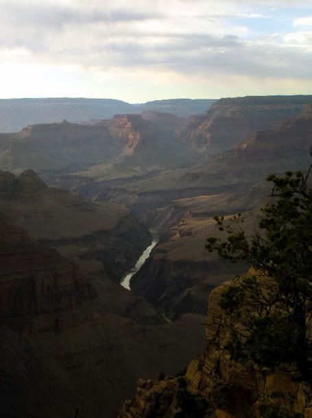
Aaron's Photography - new flicktures, october 15.
Double post, but i wanted to do a quick run over.
See how in the above photo, the horizon sits quite close to the upper third, this is to make the horizon not cut the photo in half, as such. The same is done with the sand along the lower line.
When taking photos of people, you should always try to get the main subject along one of the 2 vertical lines, as you can see, the girl is along the right line.
There may not be a grid in this one, but as you can see, the bird is sitting on the lower right intercept (spot where the horizontal/vertical lines meet) creating a better composition than if it was centered.
Thats all i can find/think of now, if i think of anything else, i'll post.


