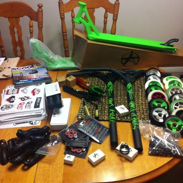
Eye Candy. (do not post your own scooter!)

Hunter Treviranus

Silver Member
dude that issue of dailed is so good.

i got my FD stuff today too but i cnat have the rest til christmas
i got white on silver sliders,soft odi's,bearings and some proto stickers/pins
 

Grant Schofield

Silver Member
dude that issue of dailed is so good.

i got my FD stuff today too but i cnat have the rest til christmas
i got white on silver sliders,soft odi's,bearings and some proto stickers/pins

Are you kidding? It sucked. They did split page ads and almost every ad sucked the only one I can remember that featured a rider was tsi but since it was a split page ad it suck because right on top of the tsi ad was a super gross inward ad.

SCOOTER COMPANY'S NEED TO HAVE A TEAM TO PUT ADS OUT. and the need to have pictures too. As for the actual mag it was ight. I like the first one better.
 

Hunter Treviranus

Silver Member
Are you kidding? It sucked. They did split page ads and almost every ad sucked the only one I can remember that featured a rider was tsi but since it was a split page ad it suck because right on top of the tsi ad was a super gross inward ad.

SCOOTER COMPANY'S NEED TO HAVE A TEAM TO PUT ADS OUT. and the need to have pictures too. As for the actual mag it was ight. I like the first one better.

dude im was just stoked for another scooter mag. i noticed the few typing errors and the half page inward ad/grit ad on every other page pissed me off.

and why the hell was dylans sequence on the last page? they should of made that the poster instead of ryans 180 railhop in my opinion
 

issac p

Silver Member
i noticed quite a few spelling errors while glancing through it, and i didnt like how close to the text got to the inside seam of the magazine. and yeah, the ads could be improved.
i also didnt like how on the stefan hefner photo it said "backside grind" when they should have wrote "backside 50-50".
EDIT: i also didnt like how the "last 5's with matt somers" wasnt at the end of the magazine. it was like right in the middle, and it had like 2 whole articles after it.
EDIT 2: I also didnt like how low quality some of the pictures were. matt somers was all pixelated.
 

Hunter Treviranus

Silver Member
i noticed quite a few spelling errors while glancing through it, and i didnt like how close to the text got to the inside seam of the magazine. and yeah, the ads could be improved.
i also didnt like how on the stefan hefner photo it said "backside grind" when they should have wrote "backside 50-50".
EDIT: i also didnt like how the "last 5's with matt somers" wasnt at the end of the magazine. it was like right in the middle, and it had like 2 whole articles after it.
EDIT 2: I also didnt like how low quality some of the pictures were. matt somers was all pixelated.

same i really didnt like how close the text was to the seam
 

tyler_magro

UN1C0RN
06C99B87-8B22-4263-8CE1-F13519CB4812-7019-0000063D2A434940.jpg
 

issac p

Silver Member
2012-11-28170013.jpg

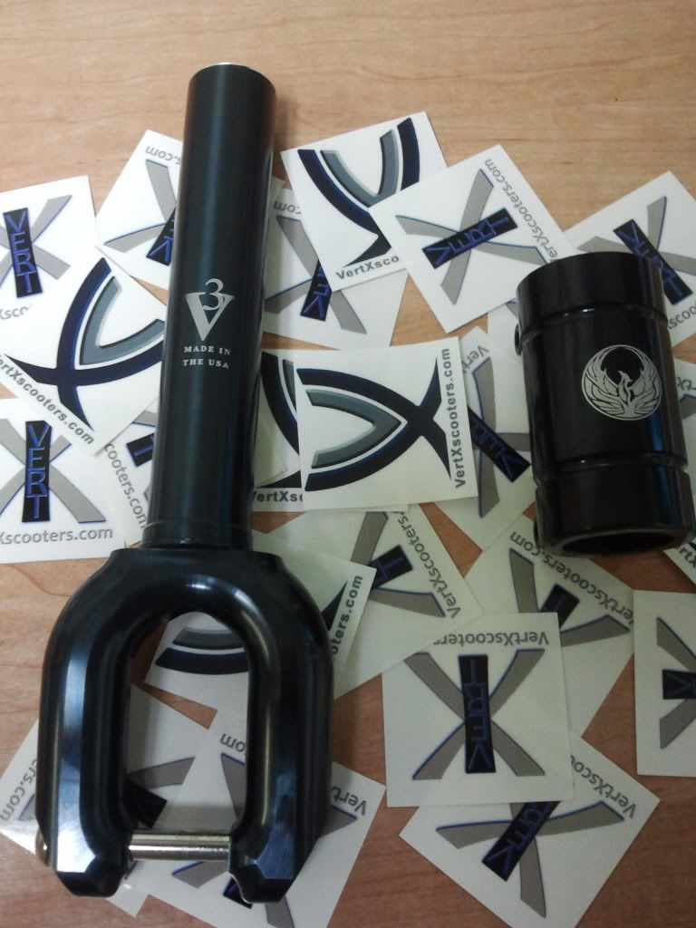
v3 smx cut to fit small scs and a phoenix scs.
the fork color isnt really black. its like dark grey with a hint of blue. it doesnt bother me though.
 

issac p

Silver Member
yeah vertx cut it for me. and its not like a normal integrated starnut. the threads dont start all the way at the top. it sits like a normal starnut, so you still have space to cut the fork down if you need to.
 
Top