I like scooter
Member

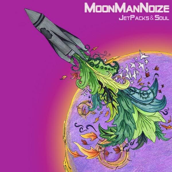
Trying out what brock has been doing.

yea, looked like it. Take more time with your stuff man!Ryan...Scott said:i was bored lol
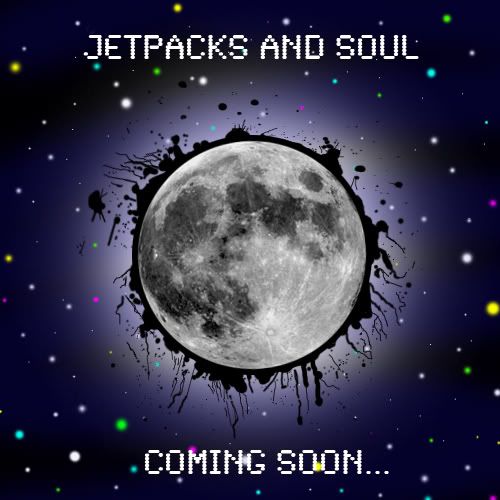
Donald Miguel said:1st pic. Looks pretty good. Open the letters up a bit more. Cant read it at all, usually I can read any of those.
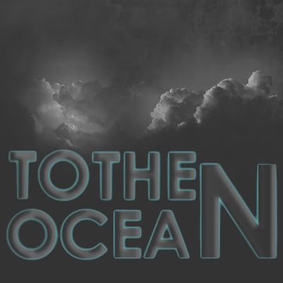
2nd pic. Great concept. Lettering needs to be fixed. The O and C dont match the width. Thin it out or space it out accordingly. 'OCEA' should be closer to the N, so widen it out.
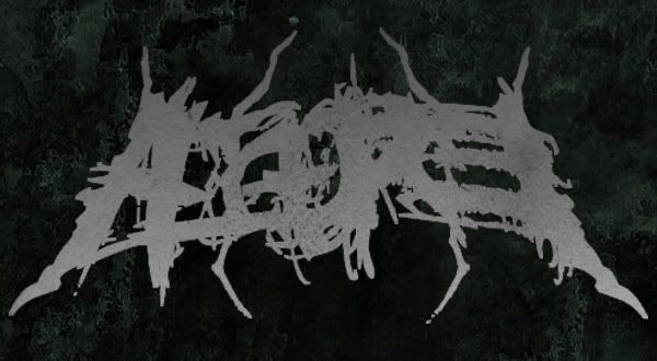
3rd pic. The effect on the band names, look terrible.
I can stop being an as.shole about work... but would you guys learn anything? Lol. Please dont take any of my criticism personally.
")
Johnpanaccione said: